Over the past year I've been commissioned by The Washington Post to create a series of typographic illustrations based off the serif typeface Big Figgins. At the end of each financial quarter of the year the paper does a business "wrap up" and the brief has been to encapsulate the overarching financial theme of the previous 3 months in the US.
![]()
Wednesday, April 4 2012
The theme for this quarterly investment outlook was based around the uncertainty of American retirees and their pensions and issues with the tax code 401(k).
![]()
Wednesday, July 11 2012
The sentiment of the second financial quarter of 2012 saw a deflation in investor optimism. The brief for this illustration was to introduce a summery feel.
![]()
Wednesday, October 3 2012
This illustration was supposed to represent post presidential election shenangians as the cover feature asks the question, "what cues will Wall Street take from the new party in power?"
![]()
Wednesday, January 11 2012
This illustration was created for the Business section of the Washington Post as part of a wrap up of the fourth financial quarter of the year and has a focus on the best way for investors to navigate through the "Euro crisis".
![]()
![]()


 And an example of its use in the TVC.


 Previous Washington Post Covers: Q4 2011, Q1 2012


 This is a piece is an exploration in tactile typography created for the group type exhibition Who Shot The Serif at Sydney's He Made She Made gallery. It utilises a series of intertwining orange cotton threads which wrap around strategically placed pins on a black background to reveal a custom type arrangement. Amazeballs!


 I was commissioned to create an illustrative type arrangement of the line "We heard it though the grapevine" to be used as part of a piece of direct mail communication for epiQure, the Qantas Frequent Flyer online food and wine community.
Agency: Jacky Winter / 303Lowe
I was commissioned to create an illustrative type arrangement of the line "We heard it though the grapevine" to be used as part of a piece of direct mail communication for epiQure, the Qantas Frequent Flyer online food and wine community.
Agency: Jacky Winter / 303Lowe


 I was invited by Canadian publication Uppercase Magazine to be one of 26 typographers, designers and illustrators to take part in an exhibition named Beautiful Bitmaps. Each artist was asked to respond to a brief based on the humble bitmap through their own capital letter, mine being the letter L.
My response is an exploration in the evolution of what is the basis of 2 dimensional screen display. What would the humble bitmap look like and how would it behave if it existed in a dynamic 3 dimensional universe?
The exhibition launched in Calgary on October 4 and the pieces are available for purchase through Society 6.
I was invited by Canadian publication Uppercase Magazine to be one of 26 typographers, designers and illustrators to take part in an exhibition named Beautiful Bitmaps. Each artist was asked to respond to a brief based on the humble bitmap through their own capital letter, mine being the letter L.
My response is an exploration in the evolution of what is the basis of 2 dimensional screen display. What would the humble bitmap look like and how would it behave if it existed in a dynamic 3 dimensional universe?
The exhibition launched in Calgary on October 4 and the pieces are available for purchase through Society 6.
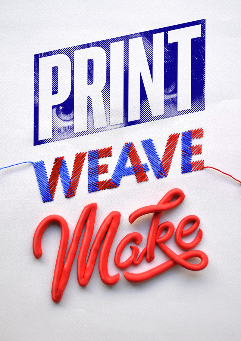 I was commissioned to create an ID for a series of open days that are happening this November at Craft, Australian Print Workshop and the Australian Tapestry Workshop.
I wanted to represent the hand crafted arts of the respective institutions through a hand crafted approach. My response was to develop a simple typographic ID and then created individual executions that represented the respective institutions texturally and aesthetically. Combining modelling clay, hand stitched letter forms and a coarse halftone pattern synonymous with the printing of yesterday I created a physical layout which I photographed and retouched.
I was commissioned to create an ID for a series of open days that are happening this November at Craft, Australian Print Workshop and the Australian Tapestry Workshop.
I wanted to represent the hand crafted arts of the respective institutions through a hand crafted approach. My response was to develop a simple typographic ID and then created individual executions that represented the respective institutions texturally and aesthetically. Combining modelling clay, hand stitched letter forms and a coarse halftone pattern synonymous with the printing of yesterday I created a physical layout which I photographed and retouched.


 Wednesday, April 4 2012
The theme for this quarterly investment outlook was based around the uncertainty of American retirees and their pensions and issues with the tax code 401(k).
Wednesday, April 4 2012
The theme for this quarterly investment outlook was based around the uncertainty of American retirees and their pensions and issues with the tax code 401(k). Wednesday, July 11 2012
The sentiment of the second financial quarter of 2012 saw a deflation in investor optimism. The brief for this illustration was to introduce a summery feel.
Wednesday, July 11 2012
The sentiment of the second financial quarter of 2012 saw a deflation in investor optimism. The brief for this illustration was to introduce a summery feel. Wednesday, October 3 2012
This illustration was supposed to represent post presidential election shenangians as the cover feature asks the question, "what cues will Wall Street take from the new party in power?"
Wednesday, October 3 2012
This illustration was supposed to represent post presidential election shenangians as the cover feature asks the question, "what cues will Wall Street take from the new party in power?" Wednesday, January 11 2012
This illustration was created for the Business section of the Washington Post as part of a wrap up of the fourth financial quarter of the year and has a focus on the best way for investors to navigate through the "Euro crisis".
Wednesday, January 11 2012
This illustration was created for the Business section of the Washington Post as part of a wrap up of the fourth financial quarter of the year and has a focus on the best way for investors to navigate through the "Euro crisis".
